Turning small, theory‑driven tests into compounding results
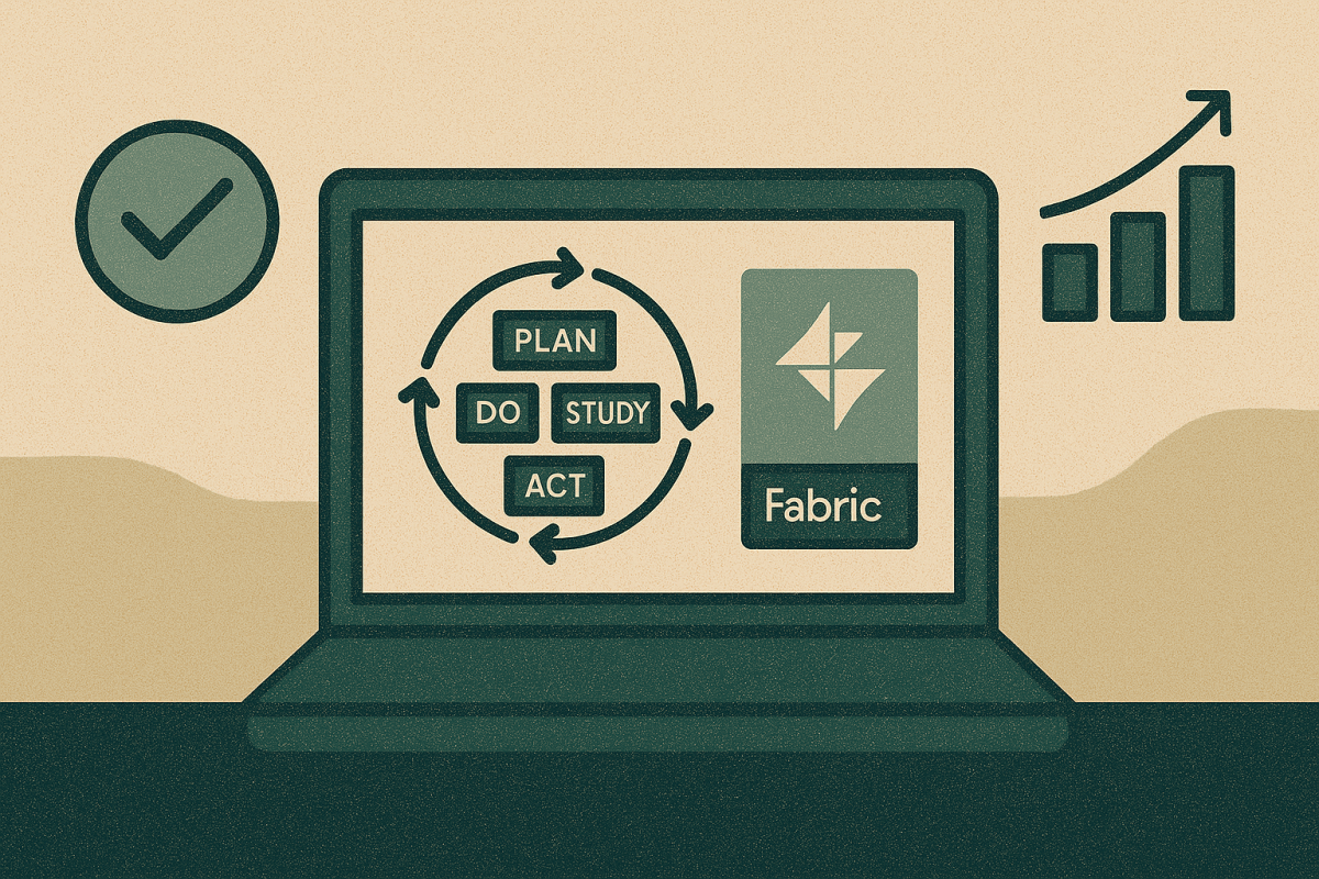
Improvement science is simple and powerful: start with a clear theory of change, run a safe test, study the data, then adopt, adapt, or abandon. The challenge isn’t running one test—it’s running hundreds of small tests, keeping their intent and results visible, and scaling what works without losing the thread.
Microsoft Fabric is a strong fit because it lets you keep the learning system (ideas, theories, PDSA cycles, decisions) right next to the evidence system (measures and run charts). Below is a high‑level pattern that puts improvement science at the center, with examples from manufacturing and oil & gas.
The pattern: a Learning Ledger next to an Evidence Lake
1) Learning Ledger (tracks the ideas and theories)
A simple set of tables in Fabric that act like a portfolio of experiments:
- Idea: title, owner, context (line/rig/asset), expected effect, start/end, test size.
- Theory / Driver: “Because ___, we expect ___ to change by ___.”
- PDSA cycles: Plan, Do dates; Study notes; Act decision (adopt/abandon/hold).
- States: proposed → testing → adopted (local) → scaled → retired.
- Links: each idea carries a stable IdeaID you’ll use to connect to measures.
2) Measure Catalog (defines how you’ll judge the change)
Operational definitions for Outcome, Process, and Balancing measures. Clear, shared definitions prevent debates later (“what counts as changeover start?” “what is ‘flaring’ in a restart?”).
3) Evidence Lake (the time‑series you already have)
Operational signals and aggregated daily/shift metrics—kept in shared tables. The important part for improvement science is the join: every run chart can be filtered by IdeaID, so you see a measure during and after a test of change.
4) Decision Trail (why you chose to adopt or abandon)
A lightweight record: run‑chart snapshots, notes from the Study step, and the final decision. Over time, this becomes your organization’s compendium of “what works here.”
5) Portfolio View (from many ideas to compounding gains)
Rollups show pipeline health (how many tests active), adoption rate, estimated impact, and—crucially—any balancing risks that surfaced.
Manufacturing example: marginal gains, visible learning
Theme: Faster changeovers; fewer micro‑stoppages
- Theory of change: “Pre‑staging tooling and a two‑person handover will reduce changeover time by 10% on Line 4 (night shift) without increasing defects.”
- Outcome measure: OEE (or throughput per hour).
- Process measure: minutes from last good to first good.
- Balancing measure: first‑hour defect rate; safety incidents.
Tracking the improvement (in Fabric):
- Log the Idea and its PDSA in the Learning Ledger (IdeaID = MFG‑014).
- Tag production runs with IdeaID MFG‑014 during the two‑week pilot.
- Show a run chart of changeover time filtered by MFG‑014, with a simple note: “special cause detected on 3/5 nights; median −8.6 min.”
- Decision: Adopt (local) and schedule a second PDSA to test on Line 3.
- Portfolio: the ledger shows MFG‑014 moved to “adopted,” projected annualized hours returned, and a green balancing indicator (defects stable).
A second micro‑gain
- Theory: “Swap nozzle and add a 30‑second purge step will reduce micro‑stoppages by 0.2% of scheduled time.”
- Same flow: small, time‑boxed test; tag data with IdeaID; run chart; decision; roll‑up. The portfolio view now shows two adopted ideas contributing to OEE, each with a transparent trail of evidence.
Oil & Gas example: reliability and emissions, tested in small steps
Theme A: Fewer flaring spikes during restarts
- Theory of change: “A gentler compressor ramp profile at restart will reduce flaring volume by 15% without increasing pressure excursions.”
- Outcome measure: flared volume per restart.
- Process measure: compliance with ramp profile.
- Balancing measure: count of pressure‑alarm excursions.
Tracking the improvement (in Fabric):
- Record Idea O&G‑031 and expected effect in the Learning Ledger.
- Tag restart events executed under the new ramp profile with IdeaID O&G‑031.
- Show a before/after run chart for flared volume, plus a simple table of balancing alarms.
- Decision: Adopt (scale) across similar assets; log the rationale and any guardrails (“revert if alarms > 2 per week”).
- Portfolio view displays expected annualized reduction and the learning note: “Works on assets with compressor type X; not tested on Y.”
Theme B: Longer ESP uptime with fewer false starts
- Theory of change: “Raising the alert threshold by a small margin will reduce false starts and increase mean time between failures.”
- Measures and tracking mirror the restart example; the ledger captures that the first PDSA improved false‑positive rate but slightly increased deferred production—flagged as a balancing trade‑off and held to local adoption only.
What makes this “improvement‑science first”?
- The idea is the primary key. Every chart, note, and decision rolls up to an IdeaID. You’re not just analyzing processes; you’re tracking the learning about your changes.
- Run charts over hero projects. Short, frequent tests with simple visual feedback beat large one‑off initiatives.
- Balancing measures are first‑class. Gains that quietly harm safety, quality, or emissions don’t get adopted.
- Transparent adoption rules. “Adopt when median improves by ≥X for Y periods and no red balancing flags.” The rule lives beside the measure.
- A living portfolio. Leaders can see which ideas are in flight, what’s adopted, where risk sits, and which patterns transfer across lines, rigs, or basins.
The Fabric building blocks you’ll use (at a glance)
- Shared lake for evidence so everyone reads the same measures.
- Simple tables for the Learning Ledger (ideas, PDSAs, decisions) that anyone can update.
- Semantic models & reports for run charts and portfolio views (filterable by IdeaID, line/rig, shift).
- Lightweight automation to nudge owners when a test window ends or when a balancing measure trips.
- Data governance so definitions and lineage are clear and trustworthy.
(Notice what’s missing: heavy, bespoke data projects. Start with the ledger + measures; let sophistication grow only where the cadence of testing demands it.)
How to start—this month
- Agree on the three measure types for your first theme (Outcome, Process, Balancing).
- Stand up the Learning Ledger (Idea, PDSA, Decision tables) and define IdeaID.
- Pick two ideas—one in manufacturing and one in oil & gas—to test for two weeks.
- Tag the data with IdeaID, publish a simple run chart per idea, and hold a brief Study/Act review.
- Adopt, adapt, or abandon, and log the decision. Then repeat—weekly.
Bottom line
Improvement science compounds when learning is easy to add, find, and trust. By keeping ideas, theories, tests, and decisions right next to measures and run charts, Microsoft Fabric turns many small, safe experiments into organization‑wide gains—on the factory floor and in the field.
Doing improvement science becomes far easier if you’ve already built a data platform, but not having one shouldn’t stop you from designing PDSAs and using improvement science to help your business. Stay tuned for a description of how you can build a small application in Microsoft’s Power Platform to track data on your improvement ideas.
